Designing a New Experience for a 50K+ User Mobile App
Rebuilt the design foundation and introduced daily content experiences to create new reasons for users to return
ROLE
Product Designer — Figma design & Lovable.ai
TIMELINE
April to July 2026 (4 months)
TEAM
CTO, PM, CEO
LIVE SITE
01
Overview
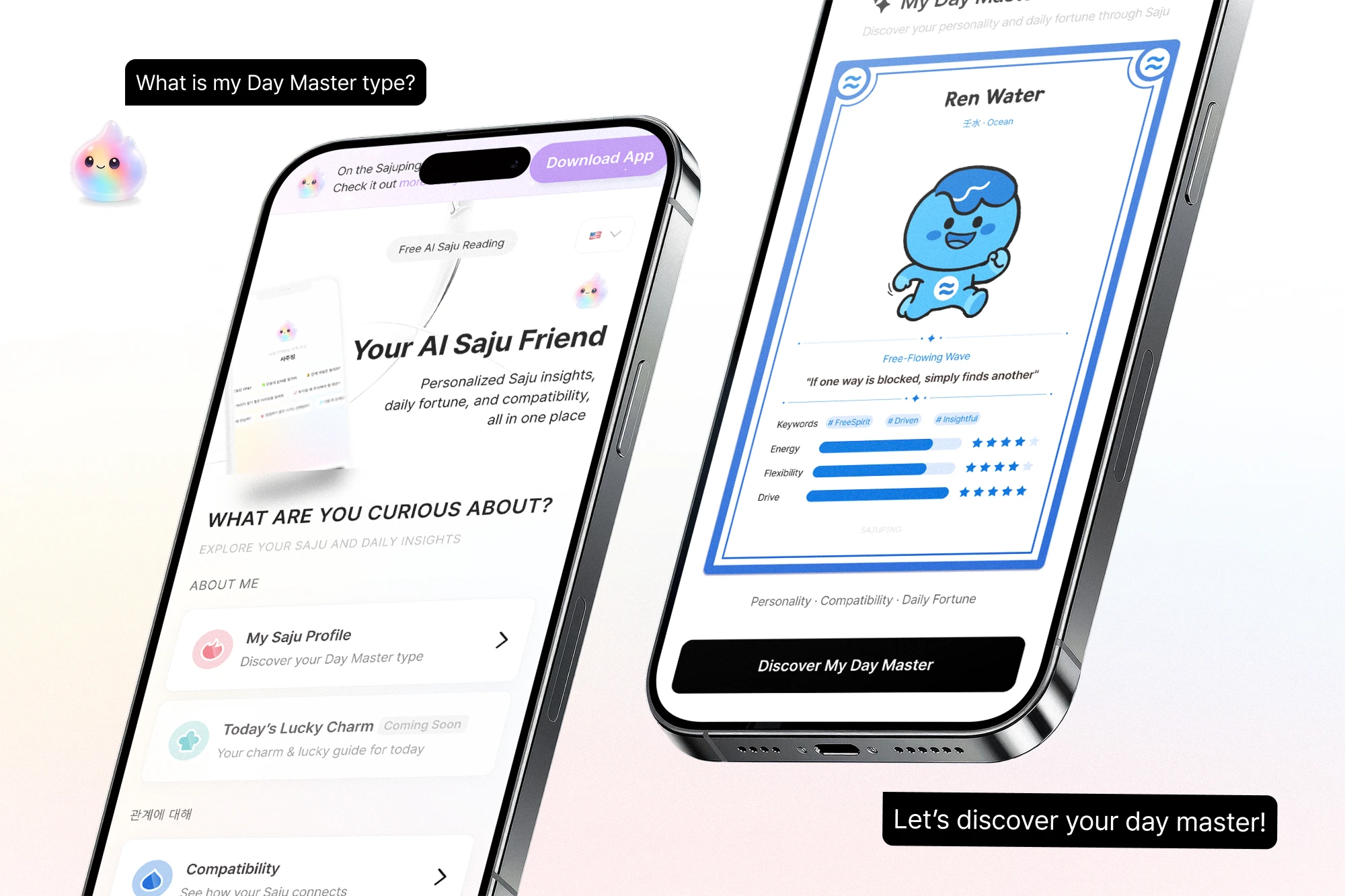
Sajuping is an AI-powered Saju service that originally existed only as a mobile app. There was no web entry point, and no reason for existing users to return once they’d seen their result.
For this project, I owned the full design process in Figma and also implemented the web experience directly using Lovable.

From a one-time result to a returning experience.
02
Discovery
Competing services followed the same pattern: users got their result once, with little reason to return. None of them had designed for return visits. That gap became an opportunity.
A more fundamental problem existed inside the product itself: no shared token system, no labeling convention, no component structure. Even the same button appeared in different colors across screens.
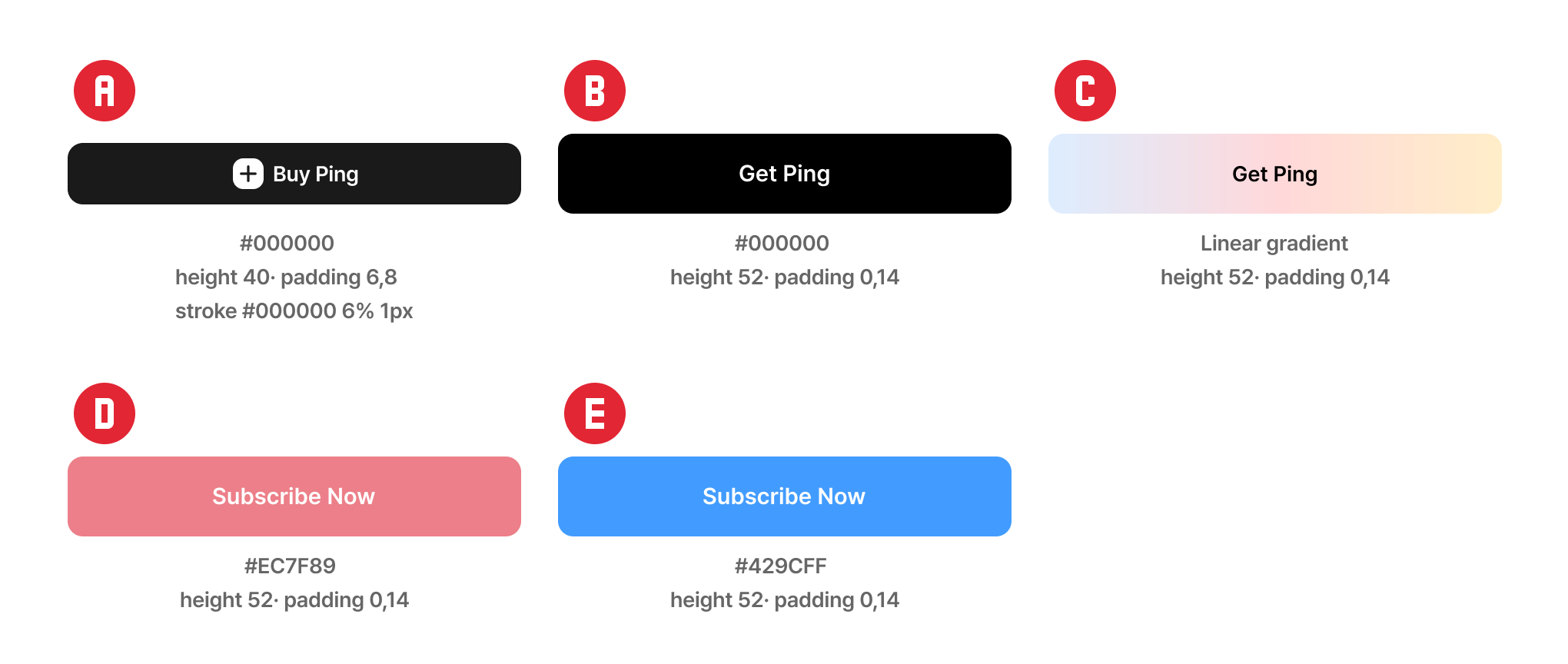
Five buttons with the same role, but five different implementations. Some are solid, one uses a gradient, and none share a token or registered variant.
03
Define & Structure
Root Problem: The absence of a web entry point blocked new user acquisition, while static Saju results gave existing users no reason to return.
Acquisition: before building the web experience, a reusable design foundation was needed.
Retention: combining fixed personal data with daily-changing content could create a reason to return.
I mapped the content on the Try Saju page first, grouping it into two tiers: card-based experiences that require input (My Saju, Charm, Compatibility), and preview content viewable immediately (daily score, ranking, AI chat).
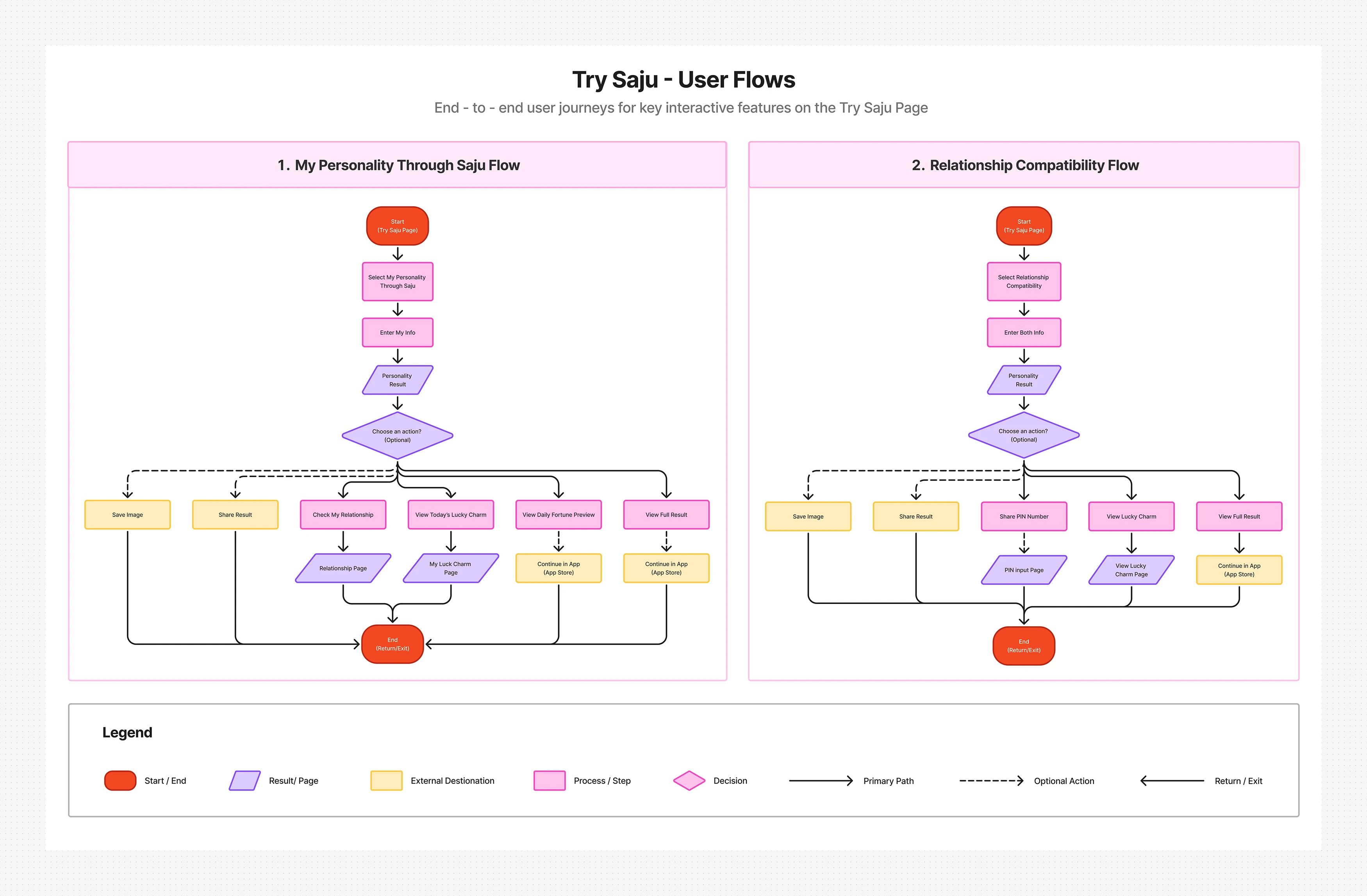
I then mapped how users move through each experience. Compatibility required a separate branch, since the result depends on another person’s participation.
I translated this structure into low-fidelity screens before any visual design began.
Once the structure was visible, the order of work was clear: the foundation had to come first, and retention features would build on top of it.
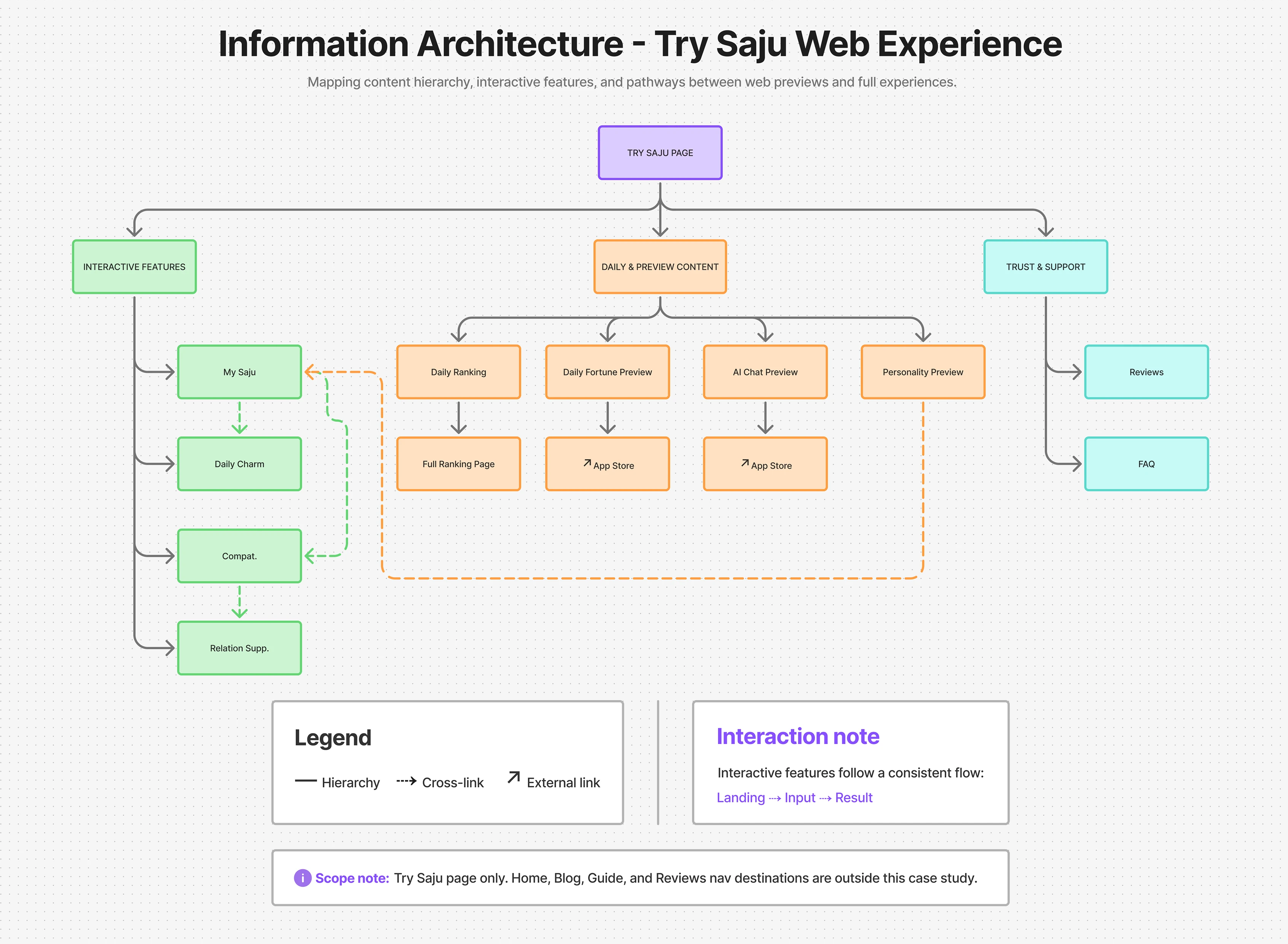
Content grouped into two tiers: cards that require input, and previews that don’t.
Two flows, one shared pattern: linear for solo results, branching for shared results.
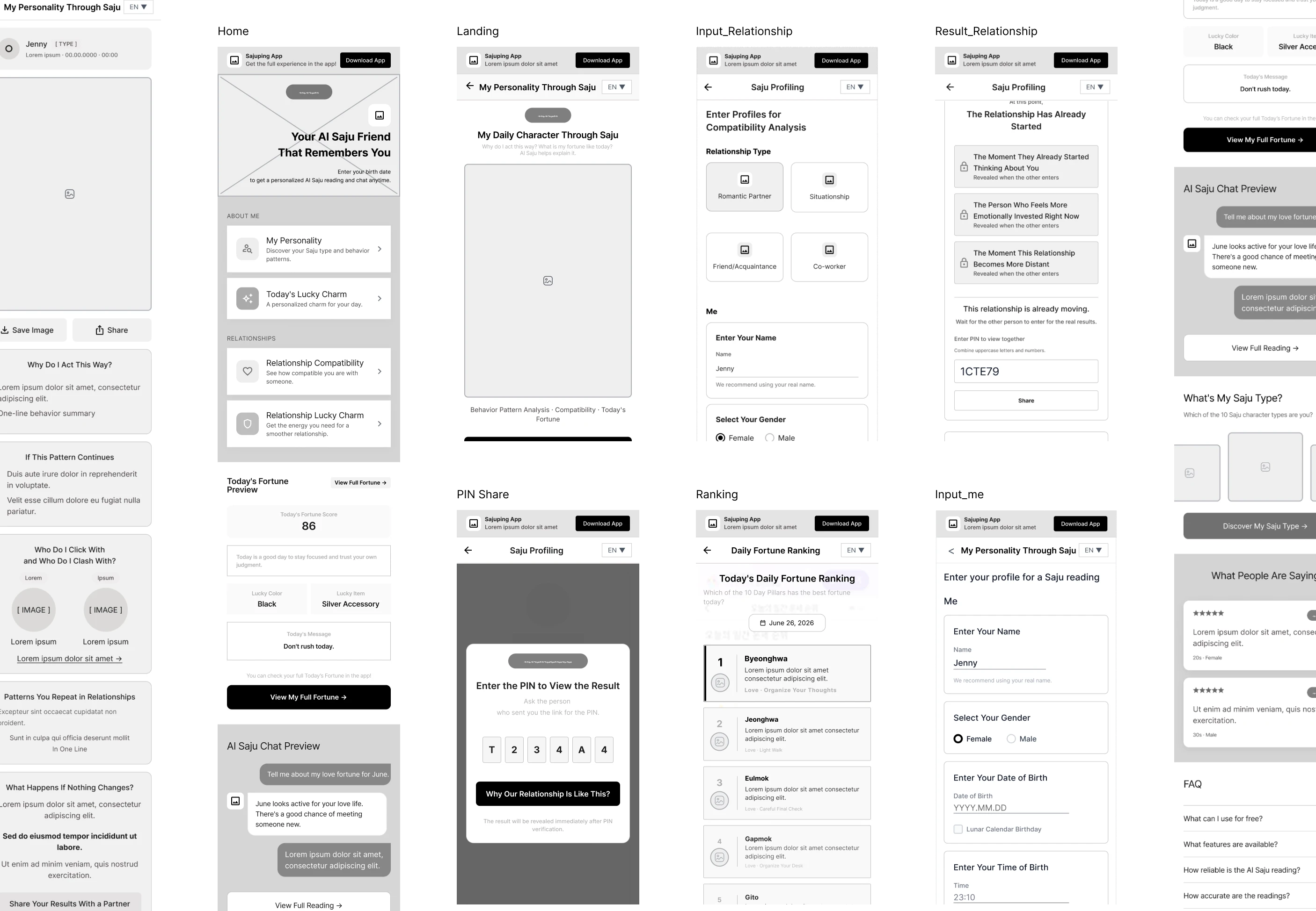
Landing, input, and result stacked as low-fidelity screens before visual design began.
04
Design System
New styles had to be built almost every time a feature was added. Before building features like Today’s Charm, I decided that a reusable foundation would make future development faster and more consistent.
I rebuilt color tokens around a Five Elements system and reorganized components around actual UI states, documenting everything on a dedicated /dev/design-system page.
The app used a fixed 390px width, which I kept on web for consistency. After feedback that it felt narrow on desktop, I added a media query to expand it to 480px. Since most traffic came from Kakao shared links on mobile, preserving the mobile form factor better matched the actual usage context.
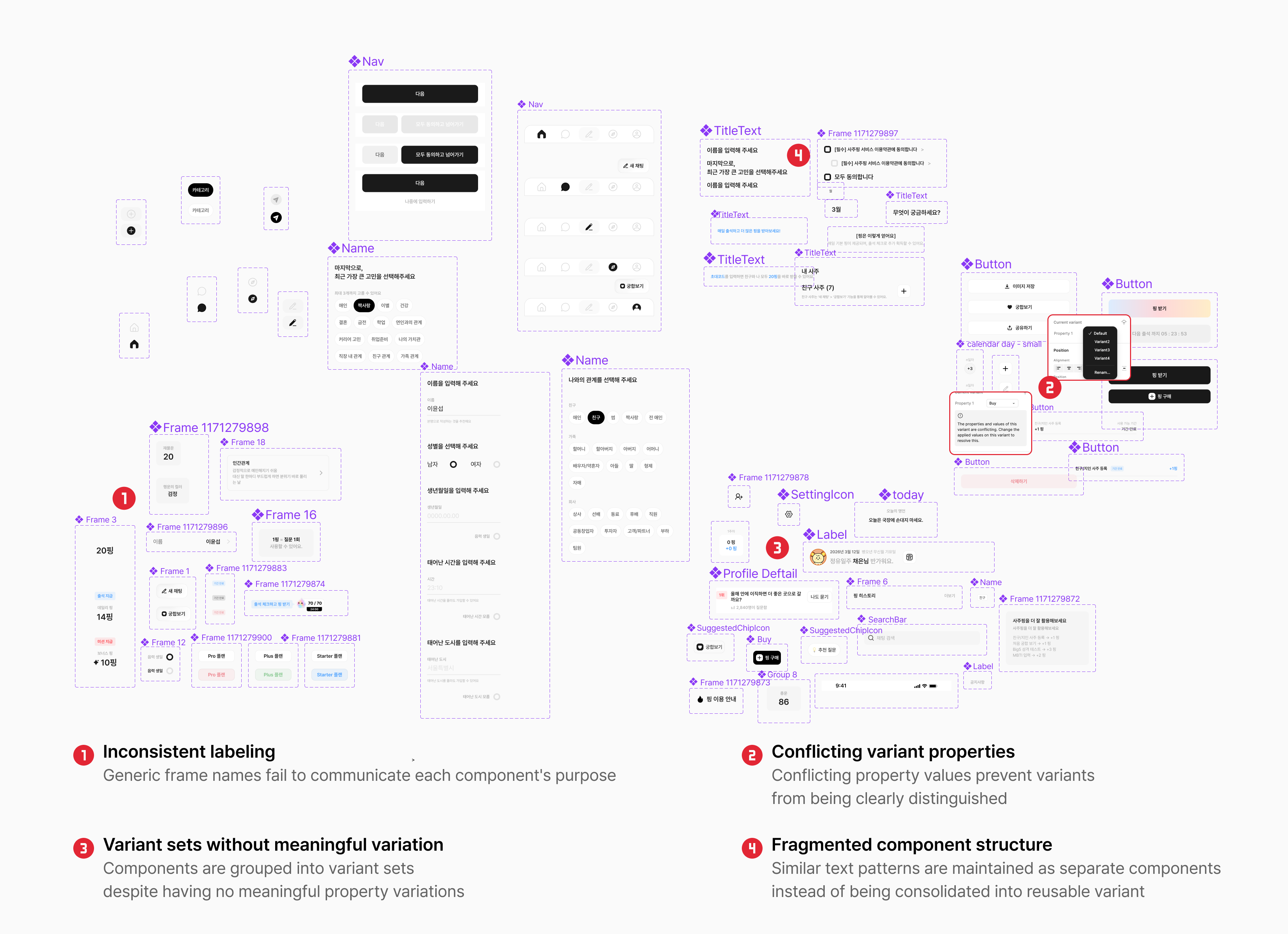
Before: components accumulated without a shared labeling convention or consistent grouping. Variant sets failed to capture real variations, and actual state changes were duplicated as separate, unregistered components.
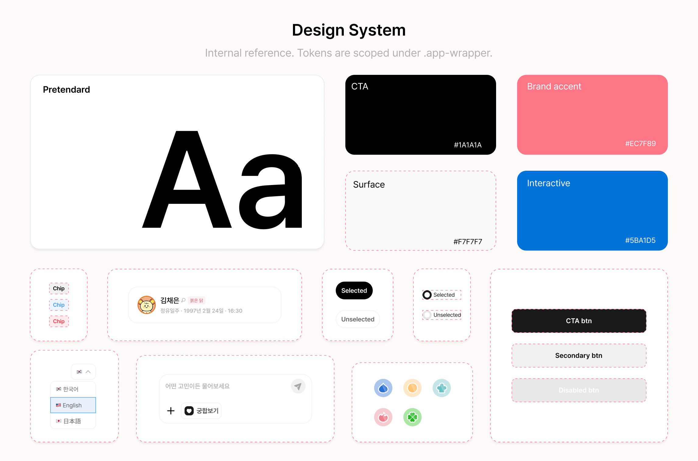
Rebuilt from scratch with color tokens, component states, and reusable UI primitives, all documented in a living design system page instead of scattered across files. Unused token definitions were flagged directly in the documentation rather than hidden.
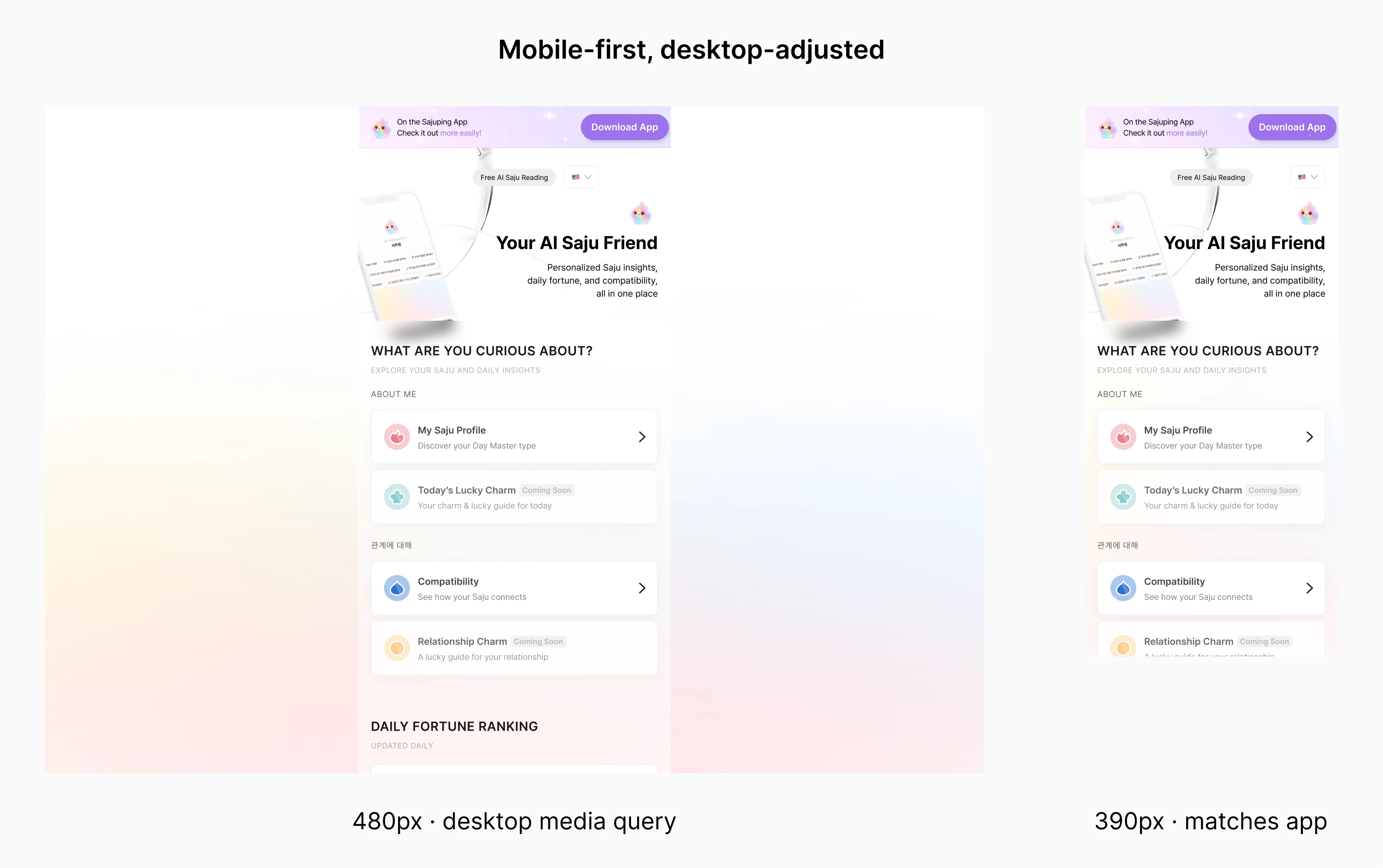
Mobile stayed at 390px to match the app, while desktop widened to 480px through a single media query. The layout structure itself remained unchanged.
05
Today’s Charm & Daily Ranking
Hypothesis: Combining a fixed personal value (one of the 10 Heavenly Stems) with a daily-changing value (the fortune score) could give users a reason to return.
A personalized charm alone felt like a weak retention trigger, so I added a second mechanism: daily ranking and comparison.
Compatibility results contain personal data, including birth dates. A shared link unlocks for both users only after the recipient enters a PIN, turning access control into a shared interaction that requires both users to participate.
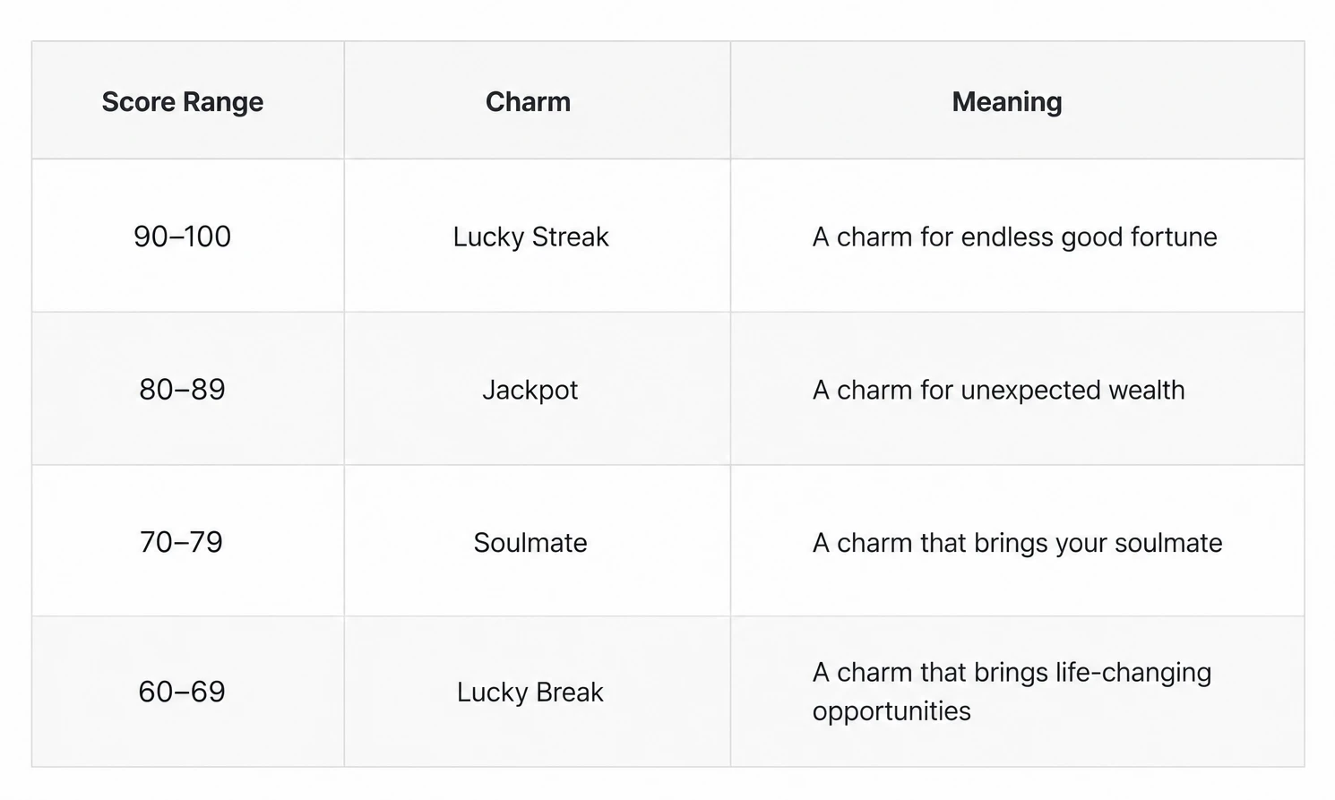
Fixed Saju data and daily changing scores create personalized content across 40 combinations, each with a unique keyword, message, and action tip.
A second retention trigger alongside the personalized charm: comparing your daily score against everyone else’s.


Compatibility results stay locked until the recipient enters a PIN, turning shared results into a participatory experience rather than a simple view.
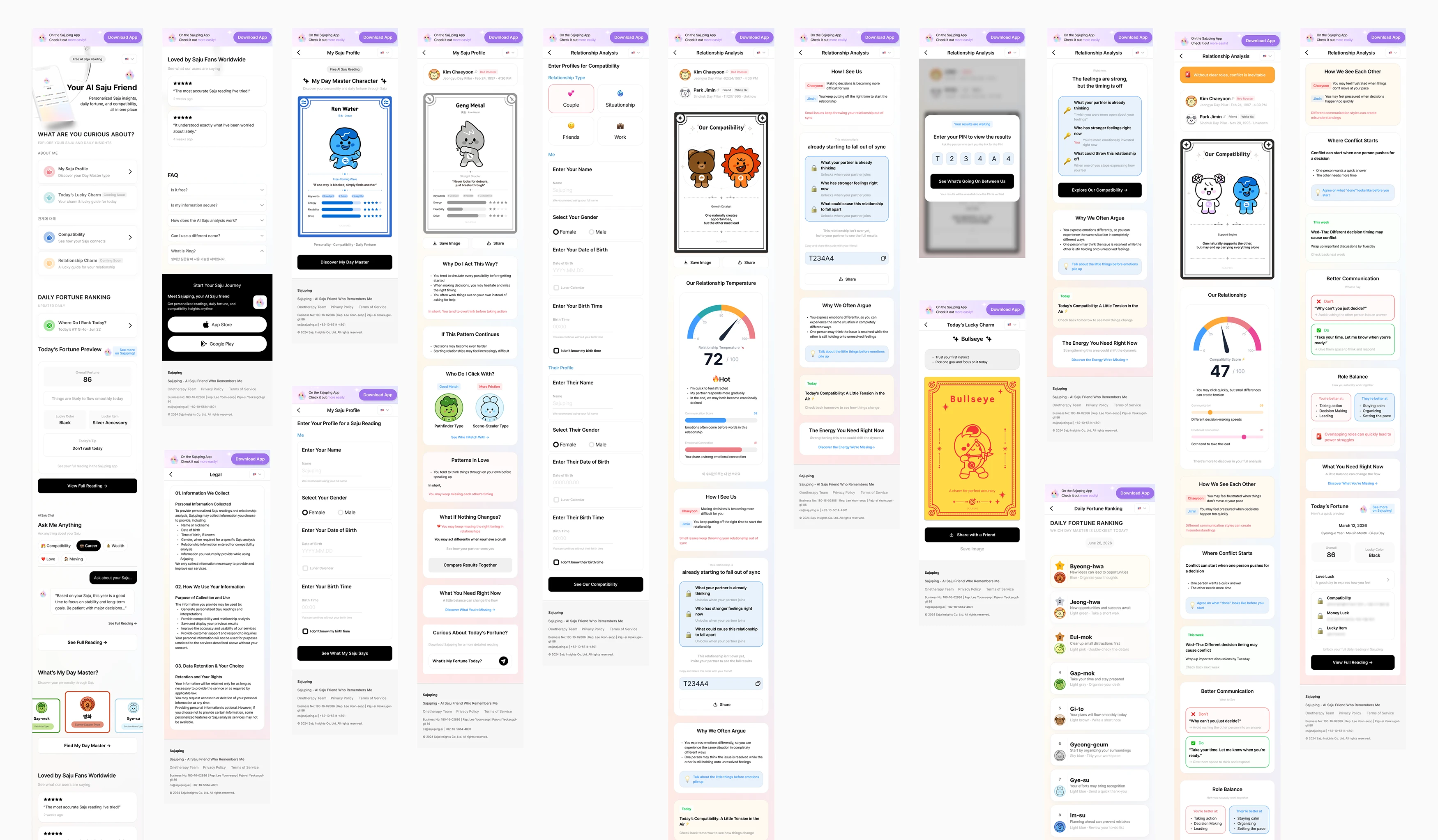
The finished Try Saju experience, from entry to daily content to shared results.
06
Reflection & What’s Next
System first, faster features. Components from 04 were reused directly in 05.
The product hasn’t launched, so retention hasn’t been validated yet. Next time, I’d test the hypothesis with a few user interviews before building the full matrix. The team will share real numbers after the Japan launch, and I’ll update this page then.
Read more of my other projects