Systemizing a Legacy Education Platform for 30K+ Users. From fragmented UI to a scalable design foundation
Subin Choi (UX/UI Designer)
1 PM · 2 Designers · 1 Database Engineer · 1 Software / 1 Machine Learning Engineer · Advisor (Stanford GSE)
OCT 2025 - DEC 2025 (3 months)
TOOLS
BACKING
Project Context
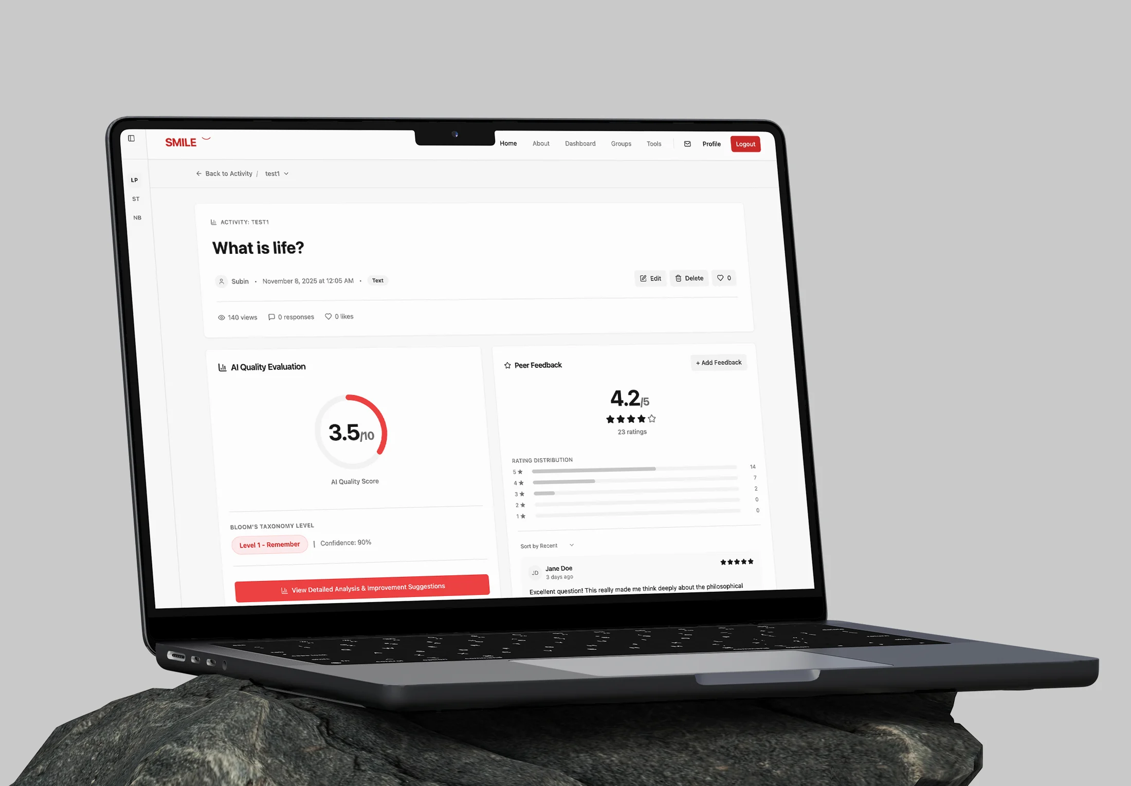
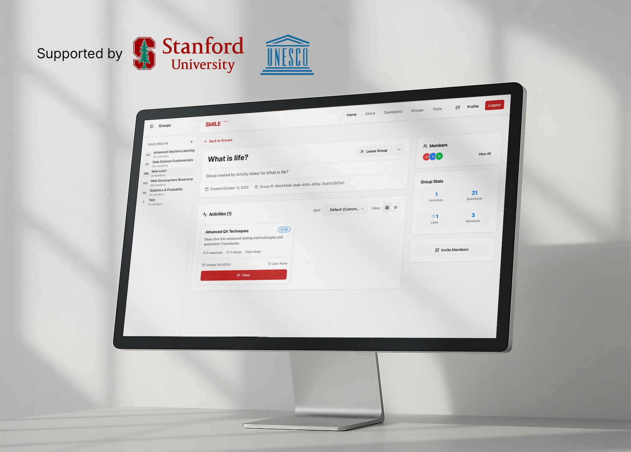
SMILE is an education platform supported by Stanford and UNESCO. While it reached over 30K sign-ups, daily active usage remained critically low.
The Problem: The Engagement Gap
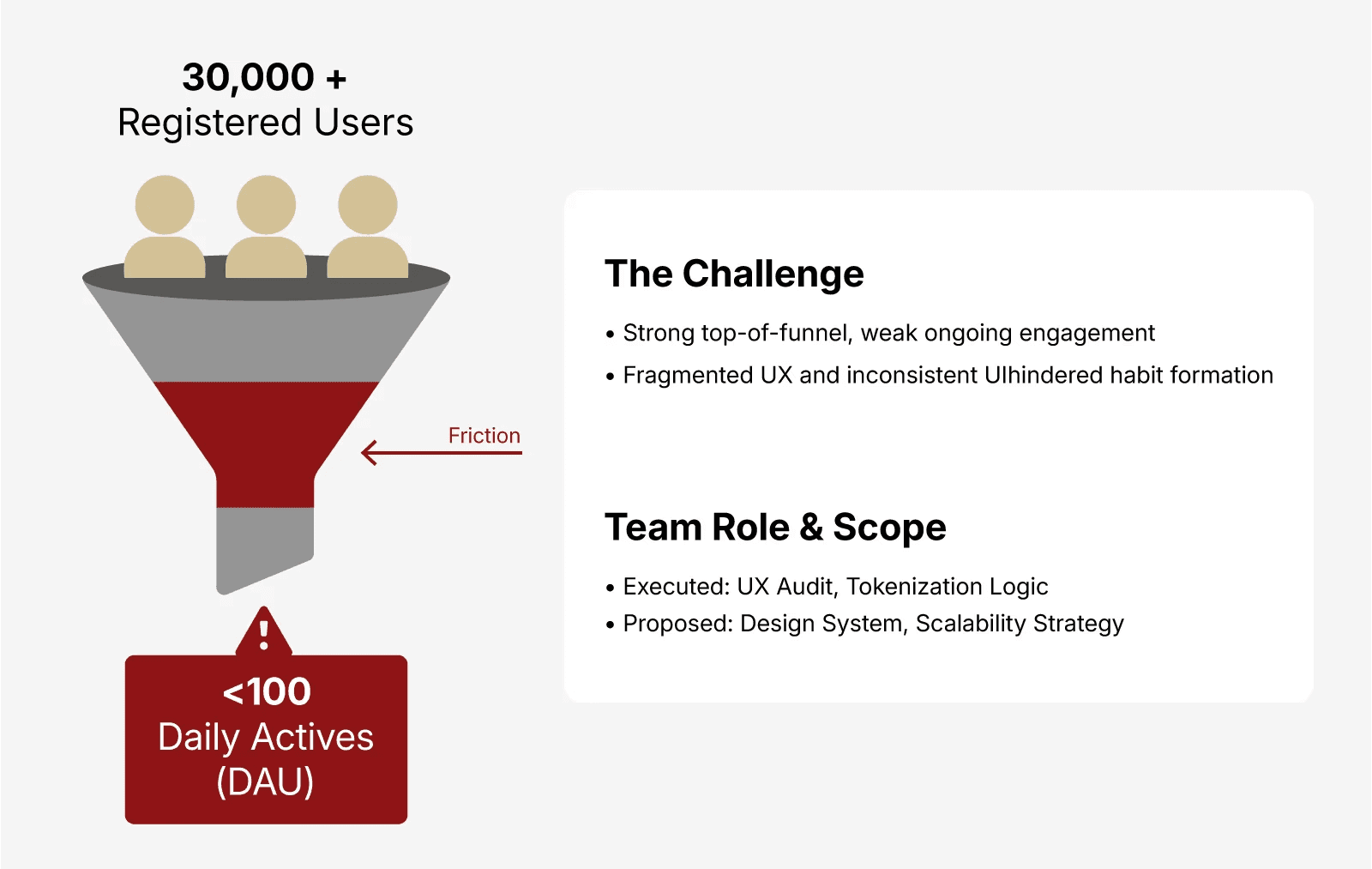
KEY INSIGNT
The issue wasn’t the content.
It was the system’s failure to guide users to their next action.
Qualitative Insights: Hearing the User
To understand the low retention, we conducted interviews with about 5 SMILE’s primary student and teacher users.
User Insights
• Too many competing actions caused confusion
• Inconsistent UI reduced trust
• Navigation required relearning each visit
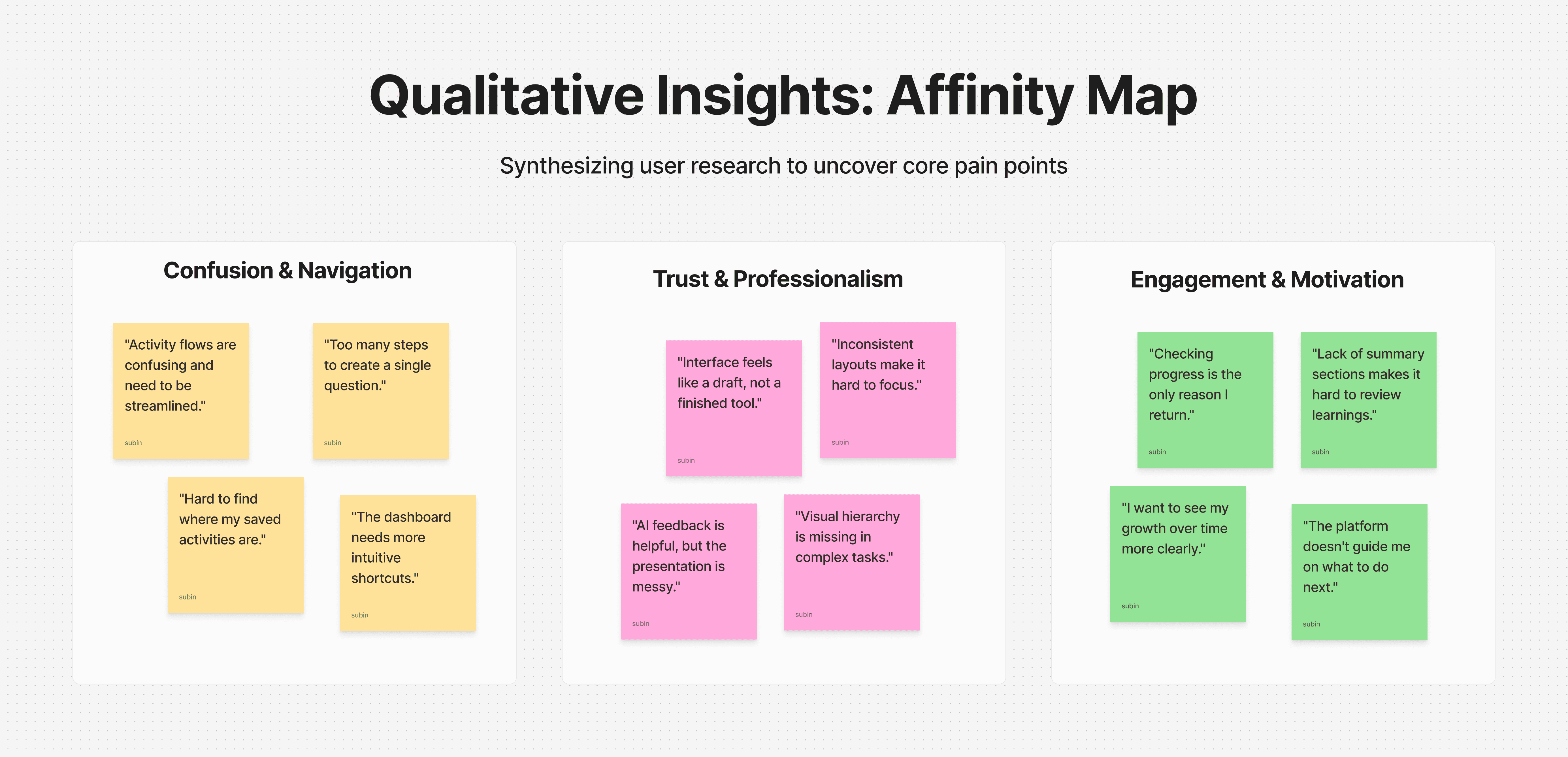
“It’s great for learning, but I feel lost in the process.”
Rather than redesigning everything, we focused on clarifying the core flow users return to most often.
Strategic Decision: Refactor vs. Redesign
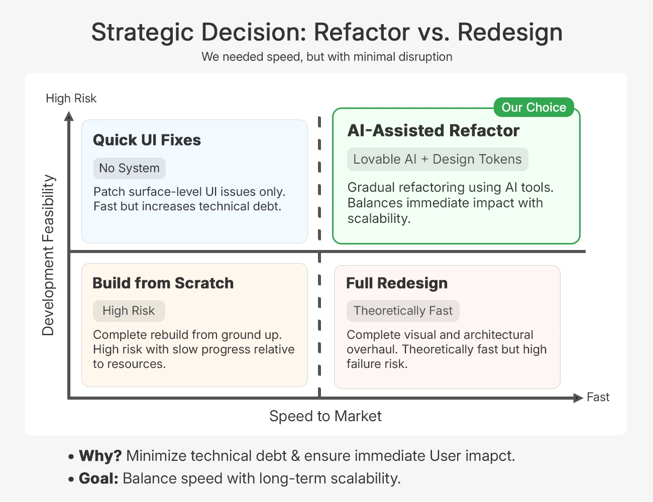
I evaluated four approaches across Speed to Market and Development Feasibility, and chose to refactor gradually using Lovable AI and Design Tokens rather than rebuild or redesign from scratch.
“Improve clarity with minimal risk”
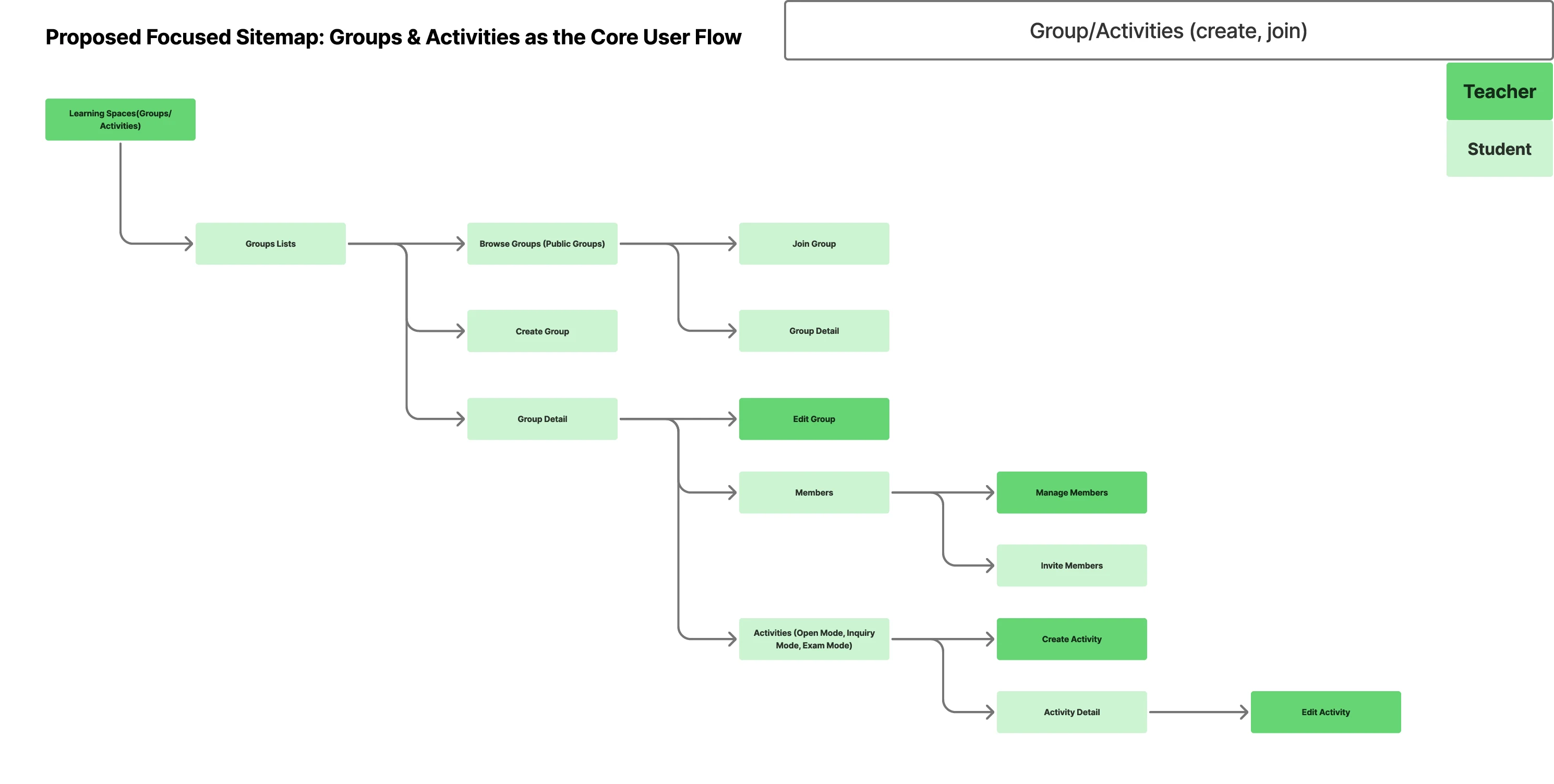
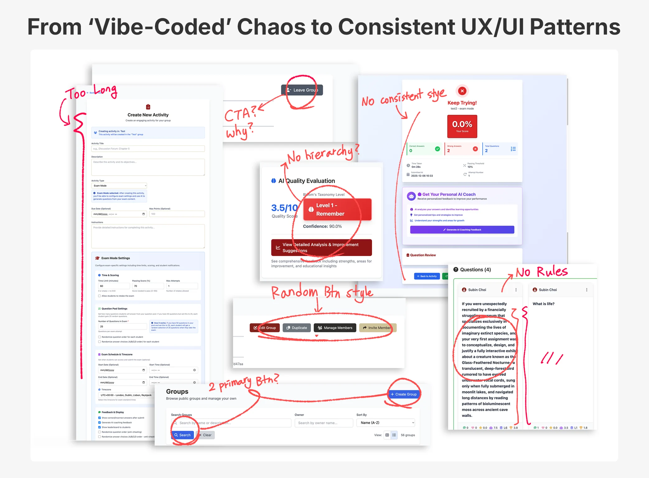
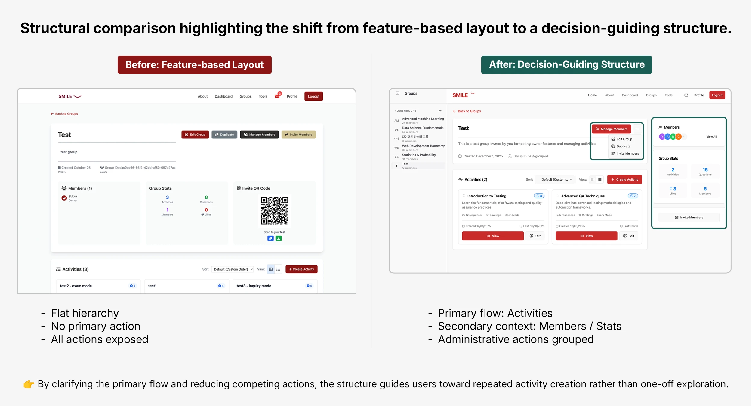
Breaking Down the Chaos
01
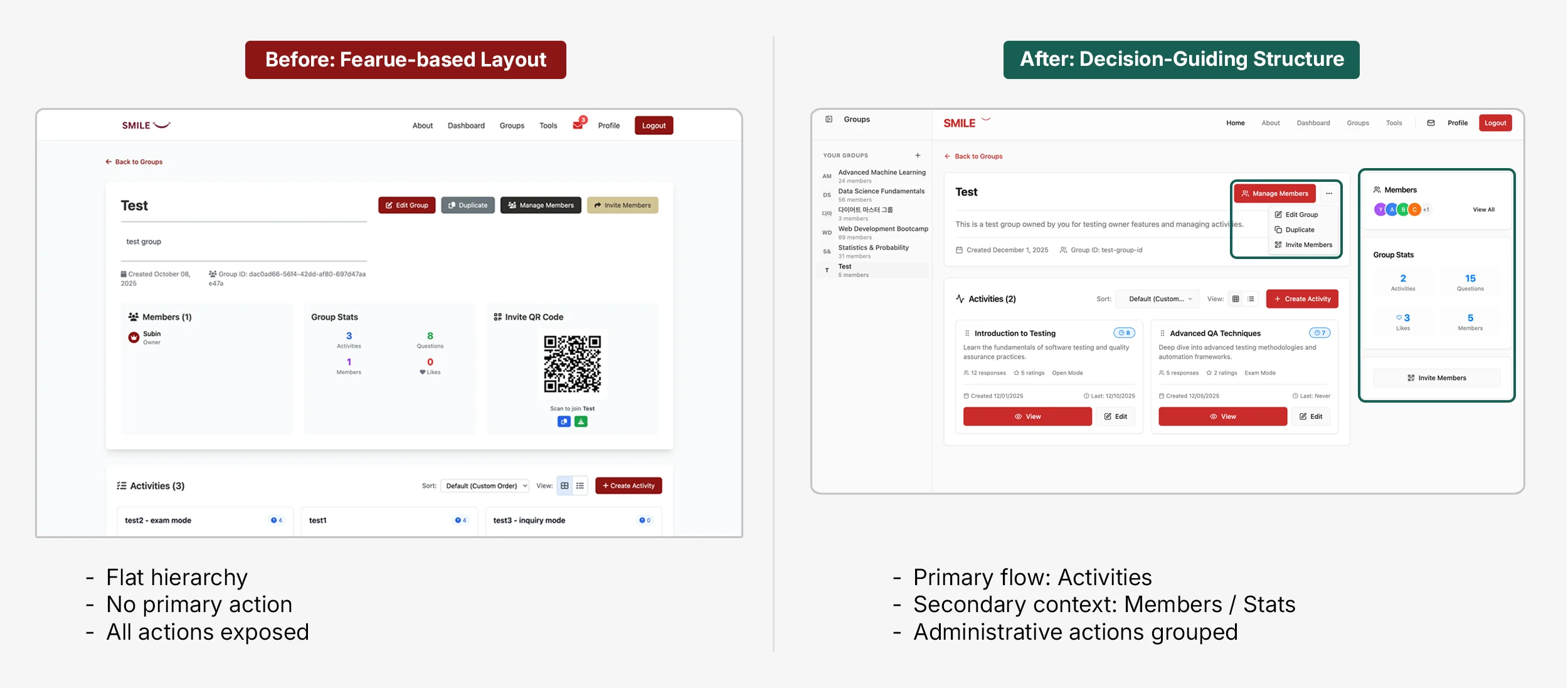
Actions such as Edit Group, Duplicate, Manage Members, and Invite Members were displayed with nearly equal visual weight.
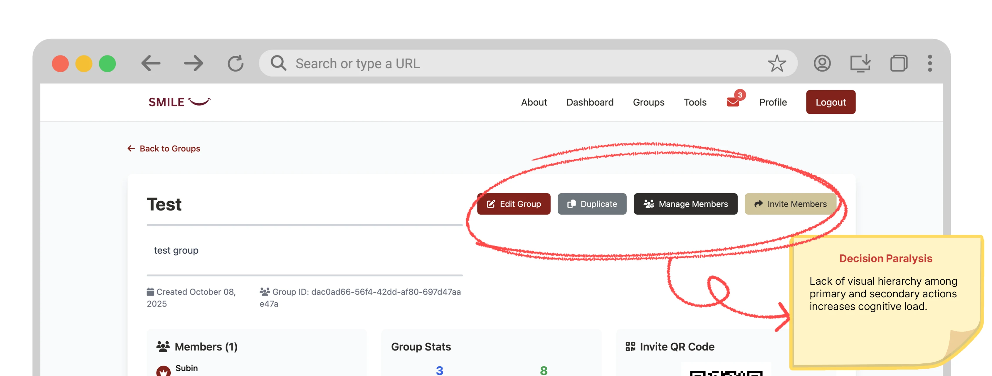
02
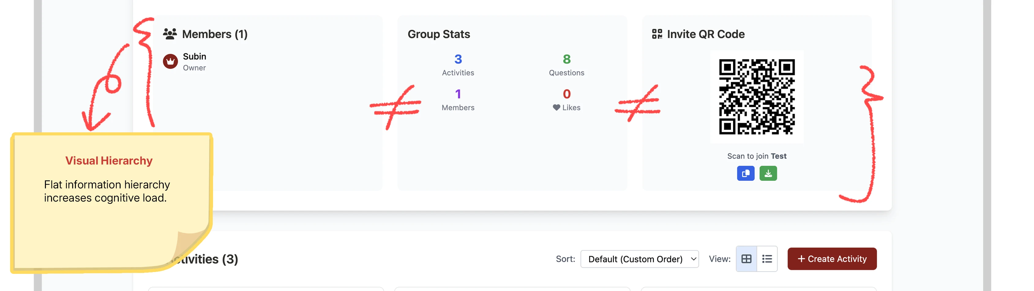
Members, Group Stats, and Invite QR Code were placed in a flat structure regardless of their importance or frequency of use.
chaos to rules
I used Lovable and Claude AI MCP to prototype quickly, then translated what worked into standardized design tokens and components.
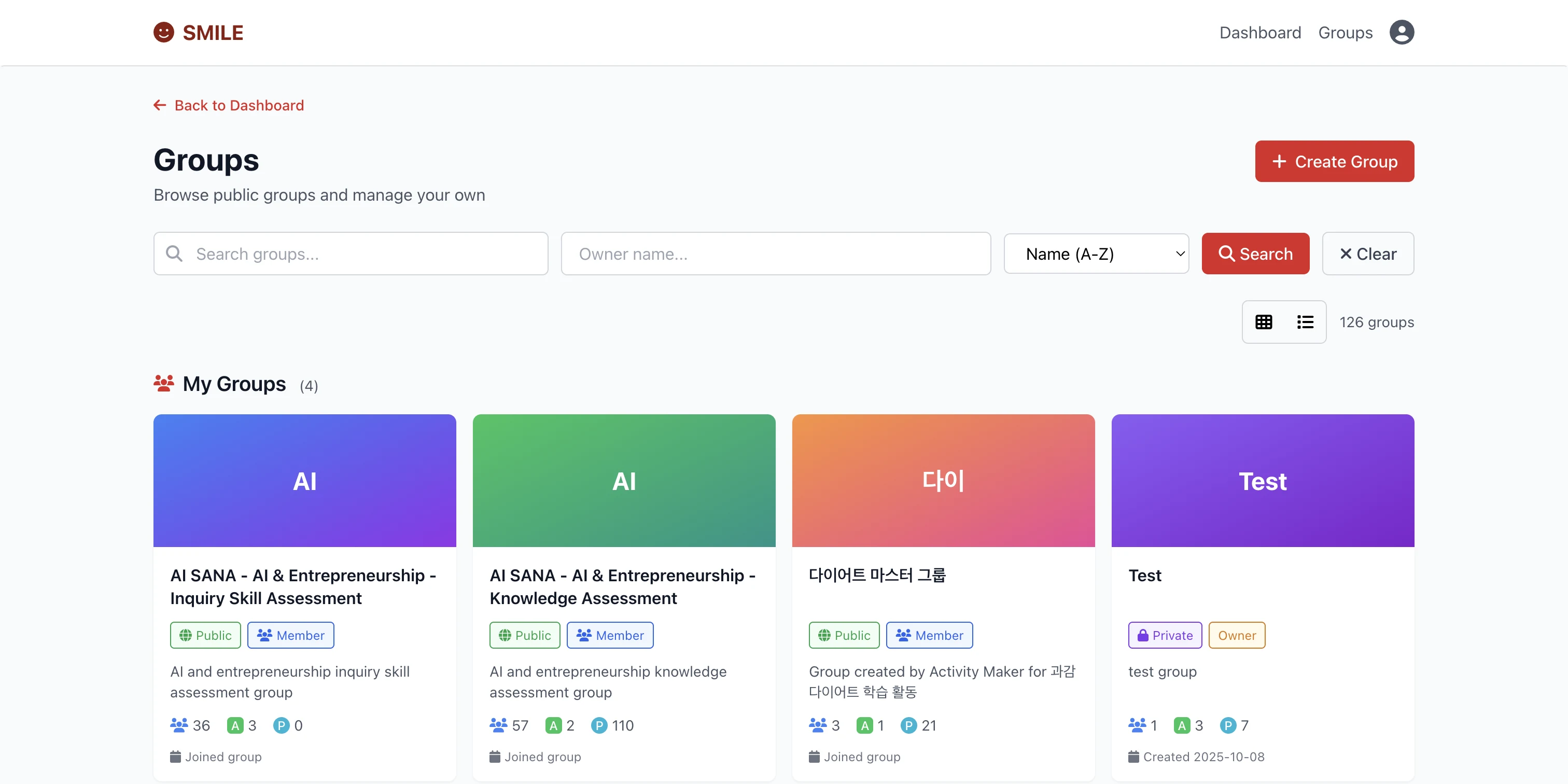
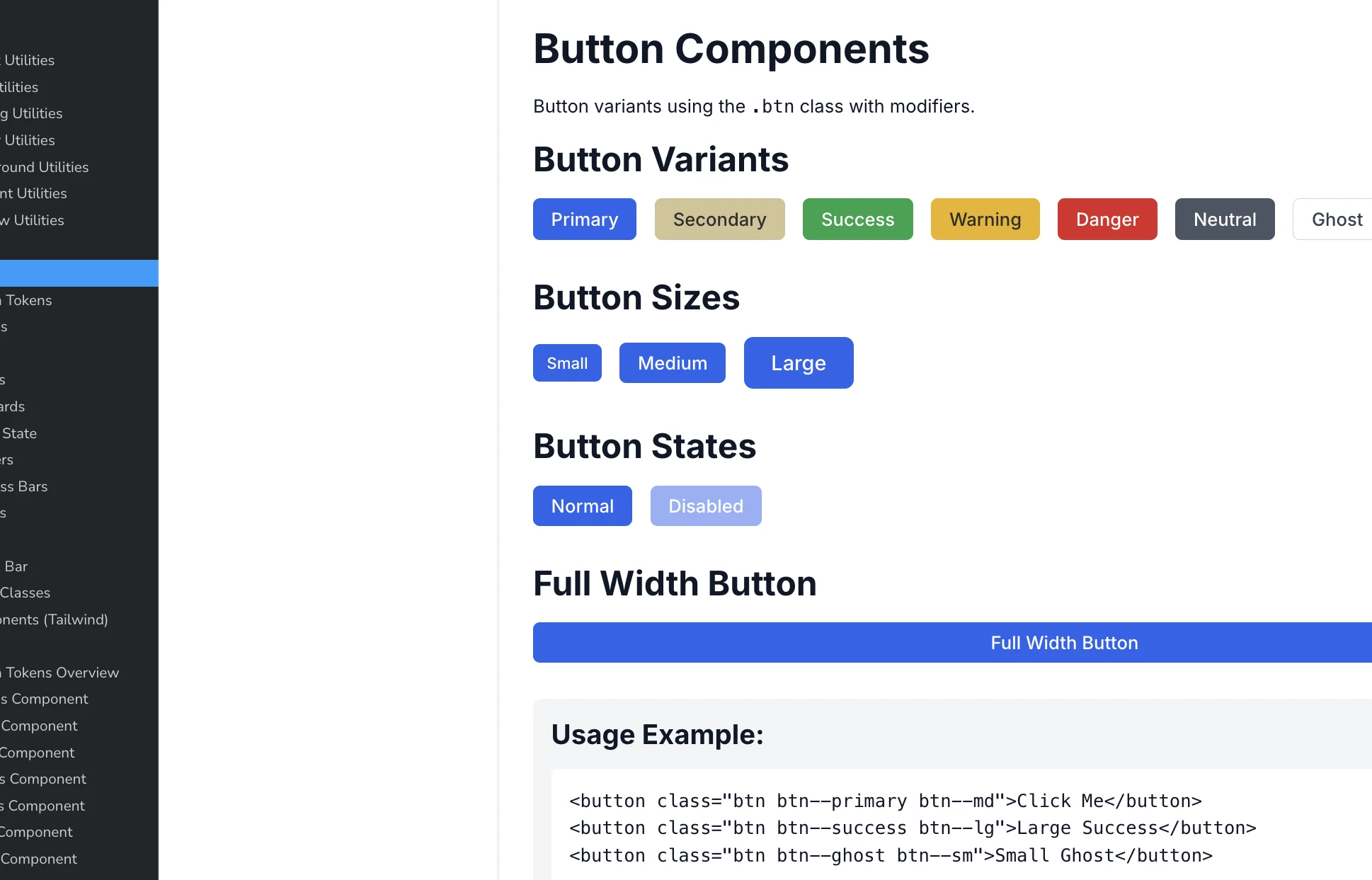
Design Tokens: (Executed) I identified recurring patterns across the fragmented interface and standardized core UI properties, including color, spacing, and button variants.
Storybook PoC: (Executed: Validation / Proposed: Product-wide implementation) I used Storybook to test whether a Single Source of Truth could work in practice, confirming that changing a token could update all connected components consistently.
Decision: Rather than rushing partially functional but unscalable code into production, I prioritized delivering a clear UX structure that could serve as a foundation for future implementation.
Key Changes
One Primary CTA Per Page
I defined one Primary CTA for each key page. Previously, actions with very different levels of importance competed for attention. Instead, I asked:
“What is the most important and frequent action a user should take on this page?”
That action became the Primary CTA, while lower-priority actions moved into an overflow menu.
Re-establishing UX Logic
Executed: Design completed and validated through Lovable prototypes
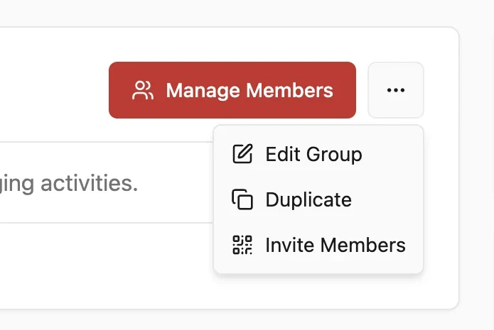
Actions were reorganized based on priority and expected frequency of use. For example, on the Group detail page, Manage Members became the Primary CTA, while Edit Group, Duplicate, and Invite Members were grouped into an overflow menu (⋯), reducing visual noise and creating a clearer action hierarchy.
Executed: Design completed
Interaction patterns that previously changed from page to page were standardized. The goal was to reduce the need for users to relearn the interface every time they entered a different part of the product.
Reducing Depth: From Multi-Step Form to Modal
Executed: Validated through a Lovable prototype; not implemented in production
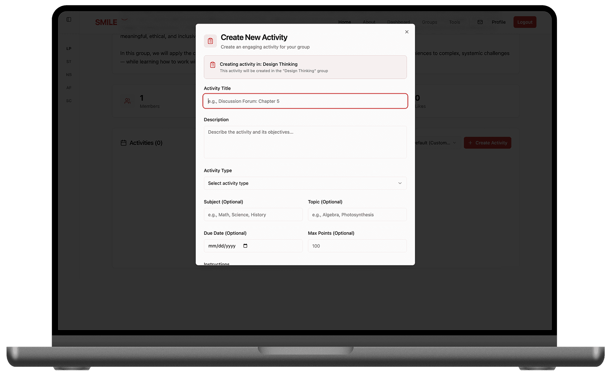
I proposed consolidating the multi-step Activity creation flow into a single modal experience, reducing unnecessary navigation depth.

By clarifying the primary flow and reducing competing actions, the new structure was designed to guide users toward repeated Activity creation rather than one-time exploration.
Design System PoC
Executed: Definition / Proposed: Product-wide Adoption
The component logic was validated through Storybook previews. However, product-wide implementation remained at the Proposed stage.
Outcome & Reflection
The biggest outcome was learning to define what could realistically be executed within the project’s resources.
Without a dedicated front-end engineer, a full UI refactor was not feasible. The Design System and Scalability Strategy were validated through prototypes but remained proposals rather than production work.
Separate execution from proposal.
I completed the UX audit, affinity mapping, and tokenization while clearly defining what exceeded engineering capacity.Make decisions through clear criteria.
The Refactor vs. Redesign framework helped prioritize incremental refactoring based on feasibility and speed to market.Build systems, not just components.
The Storybook PoC established foundational rules that future designers and engineers could build on.
Working on a platform used across 35 countries taught me how to balance design ambition with technical constraints.
Reflection: “Knowing where to draw the line became one of the most important outcomes of the project.”