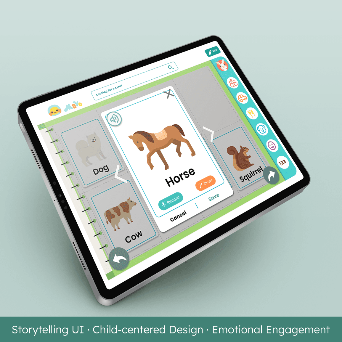
SMILE
SMILE
SMILE
Systemizing a Legacy Education Platform for 30K+ Users. From fragmented UI to a scalable design foundation
Systemizing a Legacy Education Platform for 30K+ Users. From fragmented UI to a scalable design foundation
Systemizing a Legacy Education Platform for 30K+ Users. From fragmented UI to a scalable design foundation

Team Project
Team Project
Team Project
Subin Choi (UX/UI Designer)
1 PM · 2 Designers · 2 Engineer · Advisor (Stanford GSE)
Subin Choi (UX/UI Designer)
1 PM · 2 Designers · 2 Engineer · Advisor (Stanford GSE)
Subin Choi (UX/UI Designer)
1 PM · 2 Designers · 2 Engineer · Advisor (Stanford GSE)
DURATION
DURATION
DURATION
OCT 2025 - DEC 2025
OCT 2025 - DEC 2025
OCT 2025 - DEC 2025
SCOPE
SCOPE
UX Audit, Design System (Storybook), AI-driven Refactoring (Lovable)
UX Audit, Design System (Storybook), AI-driven Refactoring (Lovable)
Project Context
Project Context
Project Context
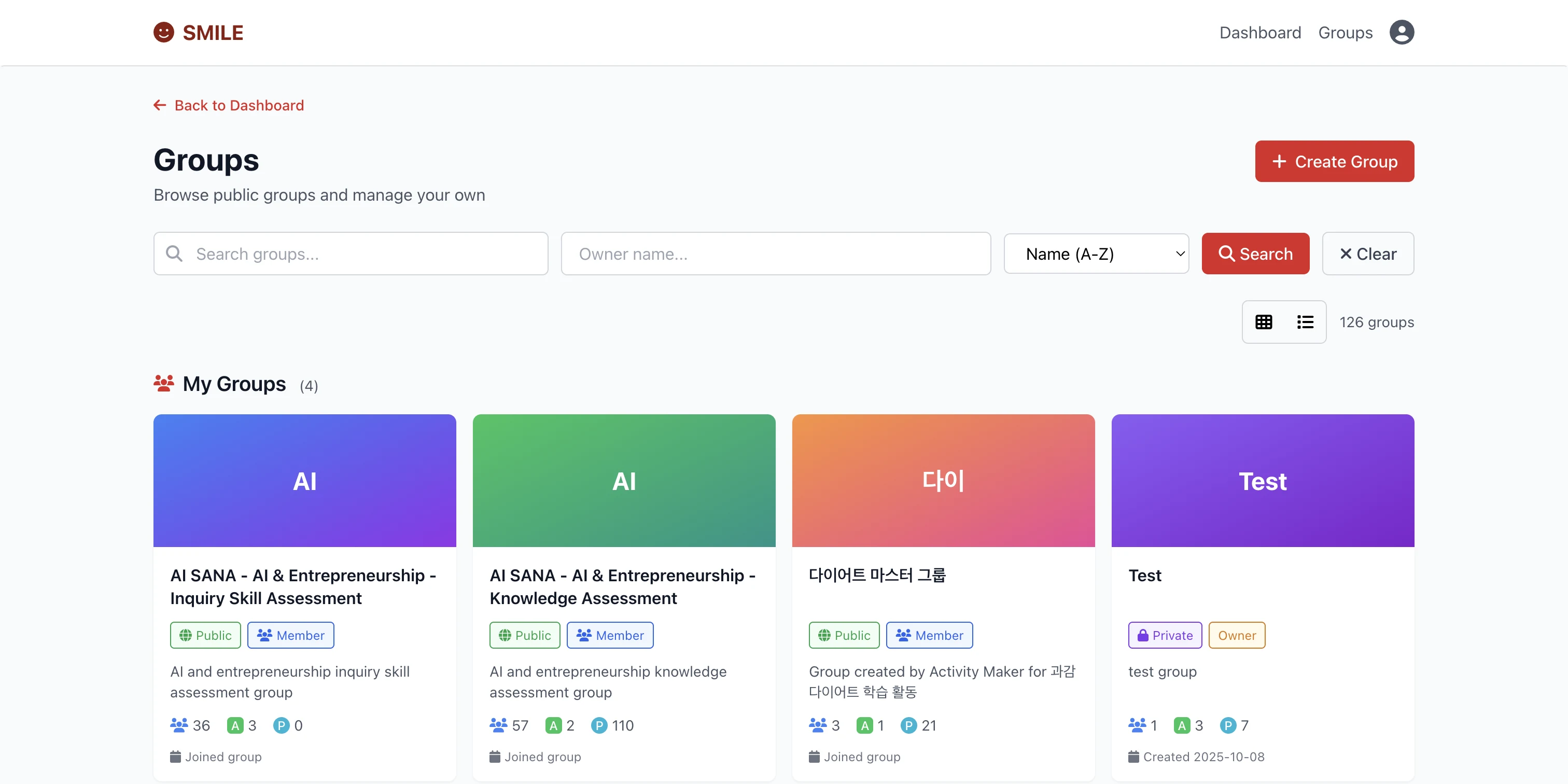
SMILE is an education platform supported by Stanford and UNESCO. While it reached over 30K sign-ups, daily active usage remained critically low.
SMILE is an education platform supported by Stanford and UNESCO. While it reached over 30K sign-ups, daily active usage remained critically low.
SMILE is an education platform supported by Stanford and UNESCO. While it reached over 30K sign-ups, daily active usage remained critically low.

The Problem: The Engagement Gap
The Problem: The Engagement Gap
The Problem: The Engagement Gap
30K+ users signed up, but fewer than 100 returned daily.
30K+ users signed up, but fewer than 100 returned daily.
30K+ users signed up, but fewer than 100 returned daily.
High initial traction, but zero retention.
High initial traction, but zero retention.
High initial traction, but zero retention.

KEY INSIGNT
KEY INSIGNT
The issue wasn’t the content.
It was the system’s failure to guide users to their next action.
The issue wasn’t the content.
It was the system’s failure to guide users to their next action.
The issue wasn’t the content.
It was the system’s failure to guide users to their next action.

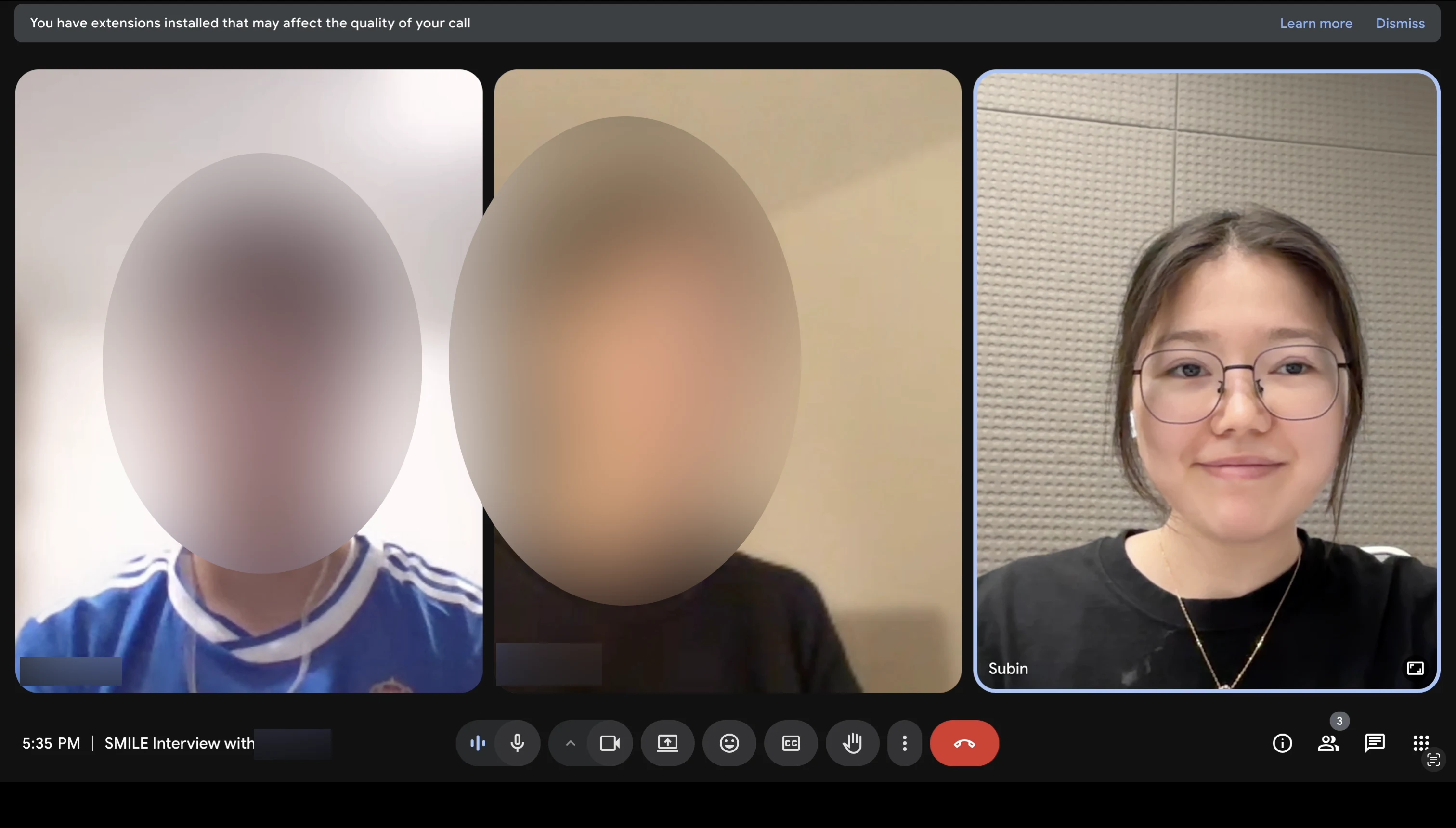
Qualitative Insights: Hearing the User
Qualitative Insights: Hearing the User
Qualitative Insights: Hearing the User
To understand the low retention, we conducted interviews with about 5 SMILE’s primary student and teacher users.
To understand the low retention, we conducted interviews with about 5 SMILE’s primary student and teacher users.
To understand the low retention, we conducted interviews with about 5 SMILE’s primary student and teacher users.
User Insights
User Insights
User Insights
• Too many competing actions caused confusion
• Inconsistent UI reduced trust
• Navigation required relearning each visit
• Too many competing actions caused confusion
• Inconsistent UI reduced trust
• Navigation required relearning each visit

"It's great for learning, but I feel lost in the process."
"It's great for learning, but I feel lost in the process."
"It's great for learning, but I feel lost in the process."
Design direction
Strategy: Pragmatic Decision Making
Design direction
Rather than redesigning everything, we focused on clarifying the core flow users return to most often.
Rather than redesigning everything, we focused on clarifying the core flow users return to most often.
Rather than redesigning everything, we focused on clarifying the core flow users return to most often.

“Improve clarity with minimal risk”
“Improve clarity with minimal risk”
“Improve clarity with minimal risk”
We narrowed the scope to the flows that define how users actually engage with SMILE.
We narrowed the scope to the flows that define how users actually engage with SMILE.
We narrowed the scope to the flows that define how users actually engage with SMILE.
Breaking Down the Chaos
Breaking Down the Chaos
Breaking Down the Chaos
01
01
01
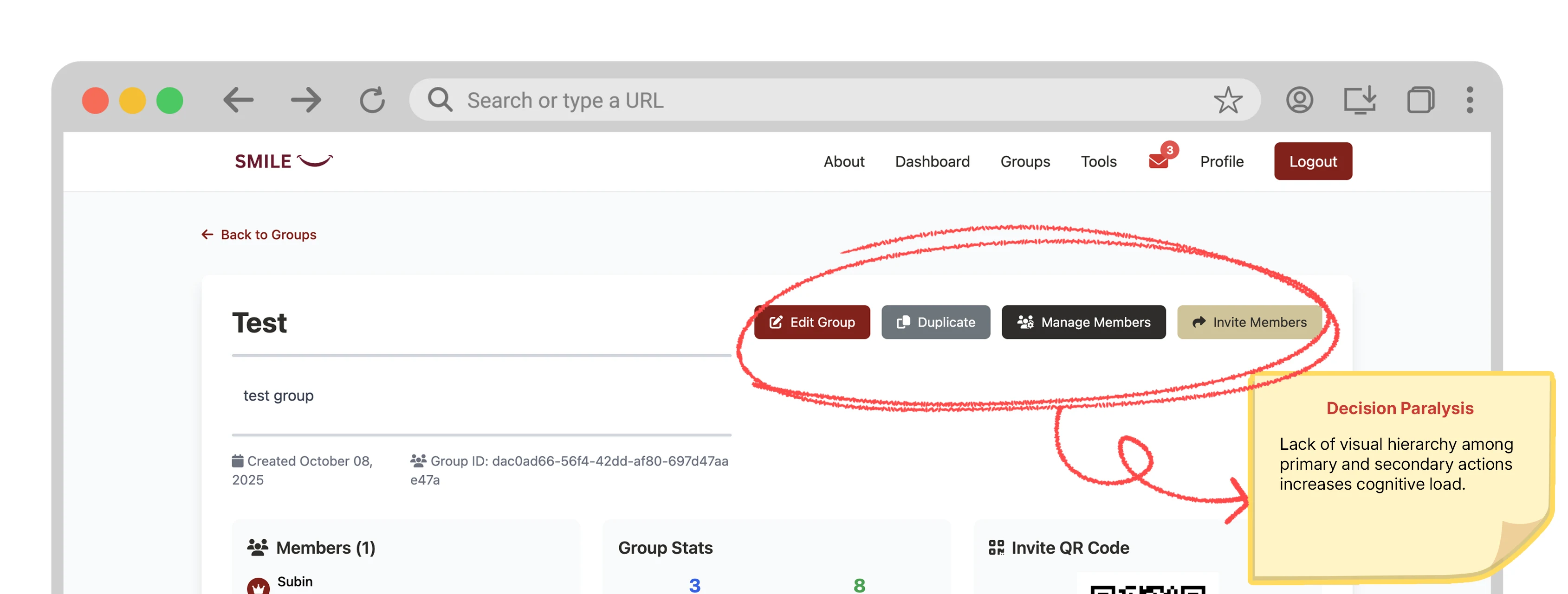
No Clear Action Hierarchy
(UI-Level Issue)
No Clear Action Hierarchy
(UI-Level Issue)
No Clear Action Hierarchy
(UI-Level Issue)
Actions and buttons with different priorities were presented at the same visual level.
Actions and buttons with different priorities were presented at the same visual level.
Actions and buttons with different priorities were presented at the same visual level.
02
02
02
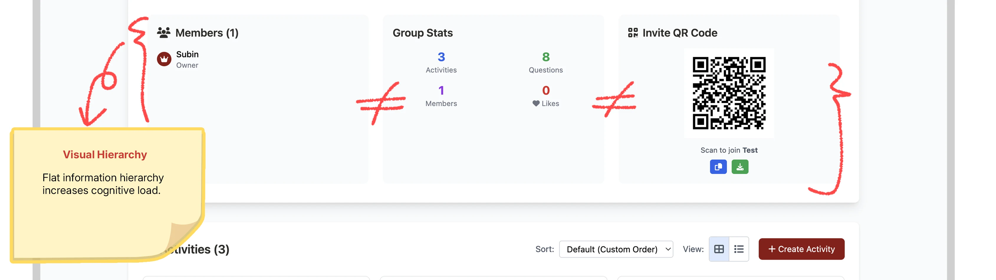
No Priority-Driven UX Structure
(UX Structural Issue)
No Priority-Driven UX Structure
(UX Structural Issue)
No Priority-Driven UX Structure
(UX Structural Issue)
Information was organized without regard to usage frequency, failing to support habit formation.
Information was organized without regard to usage frequency, failing to support habit formation.
Information was organized without regard to usage frequency, failing to support habit formation.
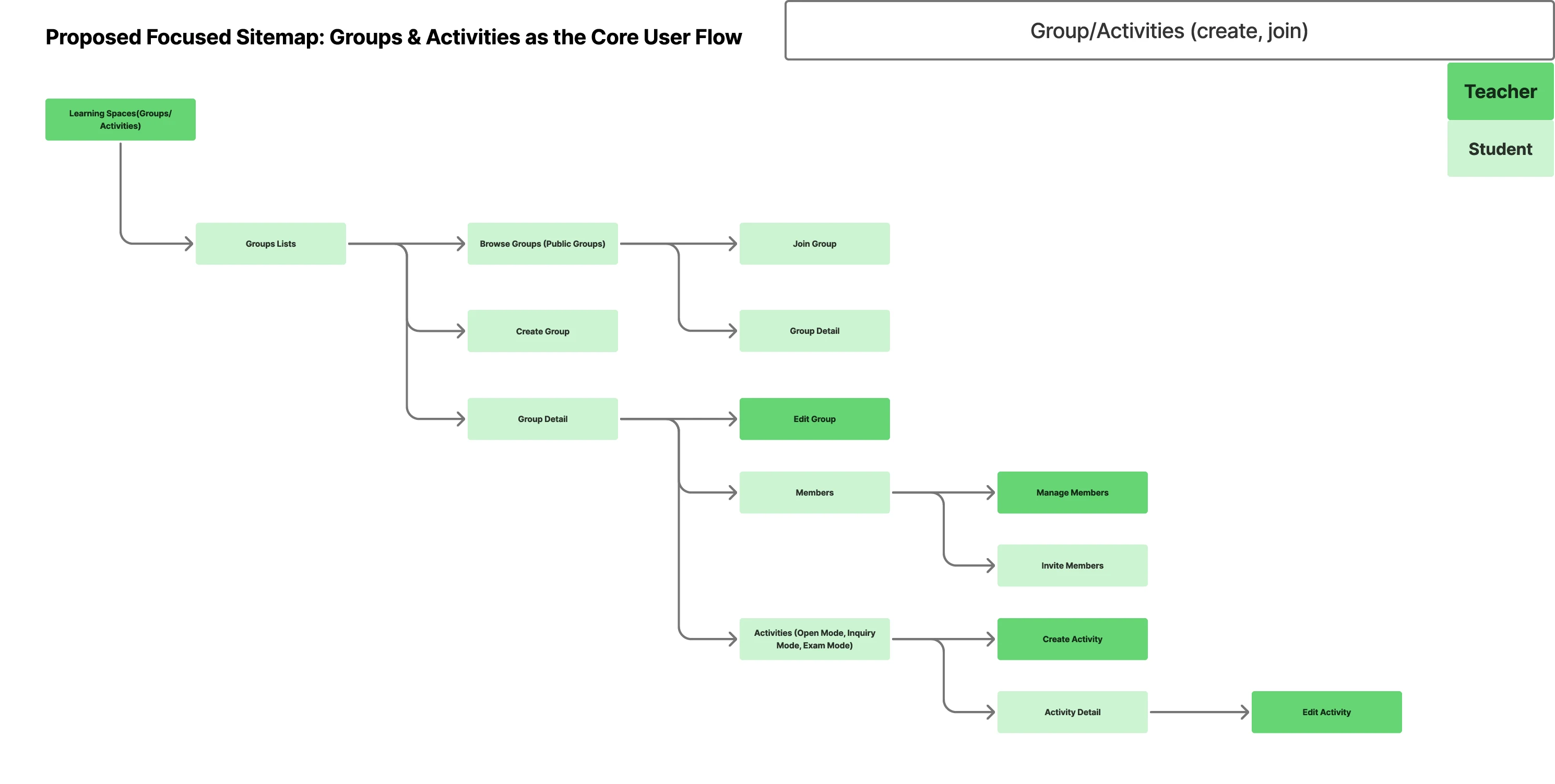
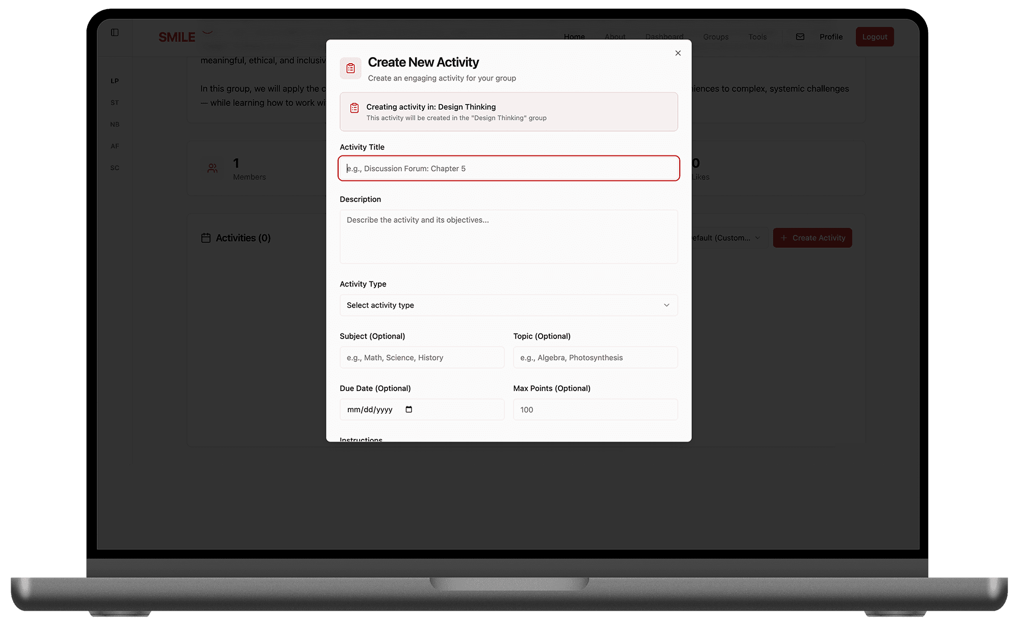
The Pivot: We stopped trying to fix "screens" and started extracting the implicit rules the product was built on.
chaos to rules
chaos to rules
chaos to rules
Leveraged Lovable and Claude AI MCP for rapid prototyping, shifting focus from speed to building a scalable UX architecture and design system.
Leveraged Lovable and Claude AI MCP for rapid prototyping, shifting focus from speed to building a scalable UX architecture and design system.
Leveraged Lovable and Claude AI MCP for rapid prototyping, shifting focus from speed to building a scalable UX architecture and design system.
Design Tokens: Standardized core attributes by consolidating consistent patterns from a fragmented UI.
Storybook PoC: Validated a "Single Source of Truth" to bridge the gap between design and engineering.
Decision: We determined that providing a correct UX structure was more valuable than shipping partial, non-scalable code.
Key Changes
Key Changes
Key Changes
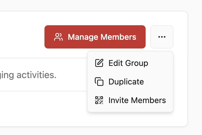
Re-establishing UX Logic
Re-establishing UX Logic
Re-establishing UX Logic
Reorganized actions by priority and usage frequency, surfacing the primary CTA while grouping secondary actions into overflow menus to reduce visual noise and strengthen visual hierarchy.
Reorganized actions by priority and usage frequency, surfacing the primary CTA while grouping secondary actions into overflow menus to reduce visual noise and strengthen visual hierarchy.
Reorganized actions by priority and usage frequency, surfacing the primary CTA while grouping secondary actions into overflow menus to reduce visual noise and strengthen visual hierarchy.
Navigation&Context Consistency
Navigation&Context Consistency
Navigation&Context Consistency
Previously inconsistent interactions across pages forced users to relearn the interface. We unified navigation and interaction rules to establish consistency and trust.
Previously inconsistent interactions across pages forced users to relearn the interface. We unified navigation and interaction rules to establish consistency and trust.
Previously inconsistent interactions across pages forced users to relearn the interface. We unified navigation and interaction rules to establish consistency and trust.
STRUCTURAL CHANGE (BEFORE / AFTER)
Strategic Pivot: From Chaos to Systemic Flow
STRUCTURAL CHANGE (BEFORE / AFTER)
We reorganized the interface around decision-making, guiding users toward a clear next step.
We reorganized the interface around decision-making, guiding users toward a clear next step.
We reorganized the interface around decision-making, guiding users toward a clear next step.

Design System PoC
Design System PoC
Design System PoC
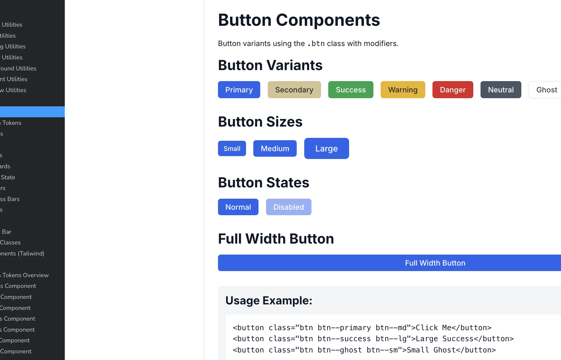
To support consistency and future growth,
we explored a lightweight design system.
To support consistency and future growth,
we explored a lightweight design system.
To support consistency and future growth, we explored a lightweight design system.
Standardized tokens
Shared components validated via Storybook
Standardized tokens
Shared components validated via Storybook
Standardized tokens
Shared components validated via Storybook
Outcome & Reflection
Outcome & Reflection
Outcome & Reflection
Learned how small structural changes impact behavior.
Experienced how design systems support consistency.
Collaborated closely with engineers in a live product.
Learned how small structural changes impact behavior.
Experienced how design systems support consistency.
Collaborated closely with engineers in a live product.
Learned how small structural changes impact behavior.
Experienced how design systems support consistency.
Collaborated closely with engineers in a live product.
Reflection: "UX design is not about making screens look better; it's about deciding what to change and what to preserve within a complex, legacy system."
Reflection: "UX design is not about making screens look better; it's about deciding what to change and what to preserve within a complex, legacy system."
Reflection: "UX design is not about making screens look better; it's about deciding what to change and what to preserve within a complex, legacy system."

Read more of my other projects
Read more of my other projects